Astral Beverage Branding & Packaging Design
Self-Initiated Brand Identity System
2025
Brand Strategy
Visual Identity
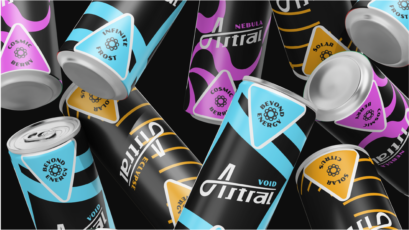
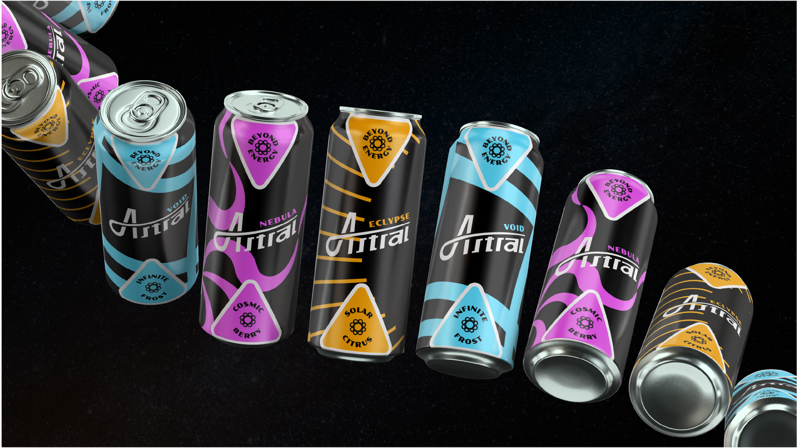
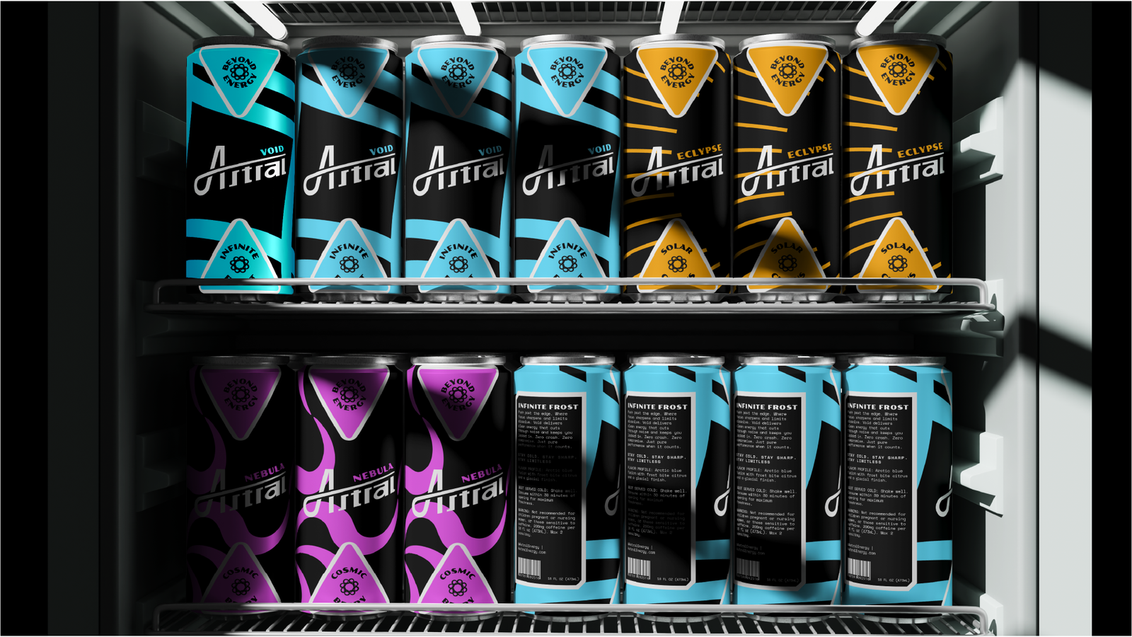
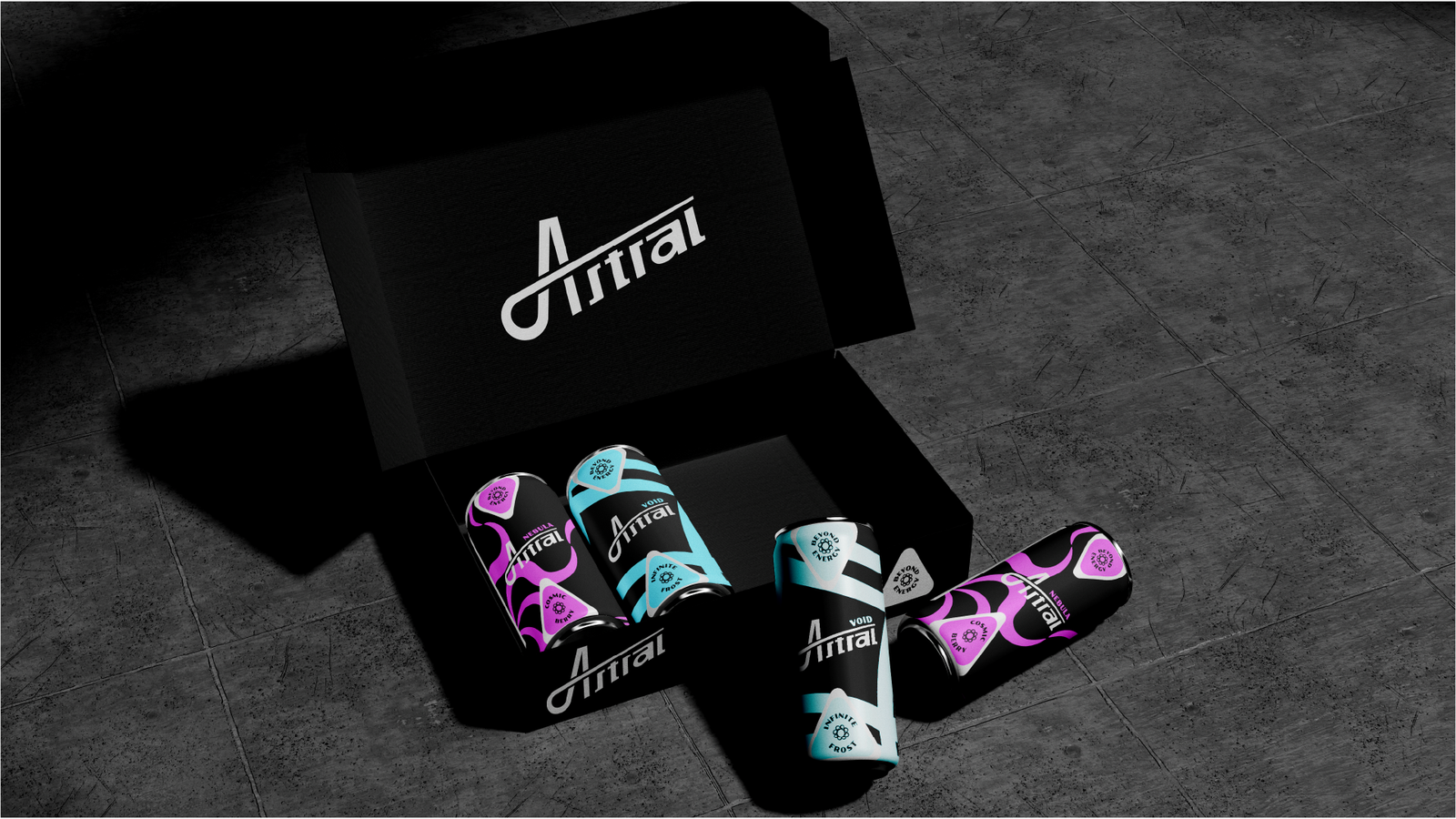
Packaging Design (3 Flavors),
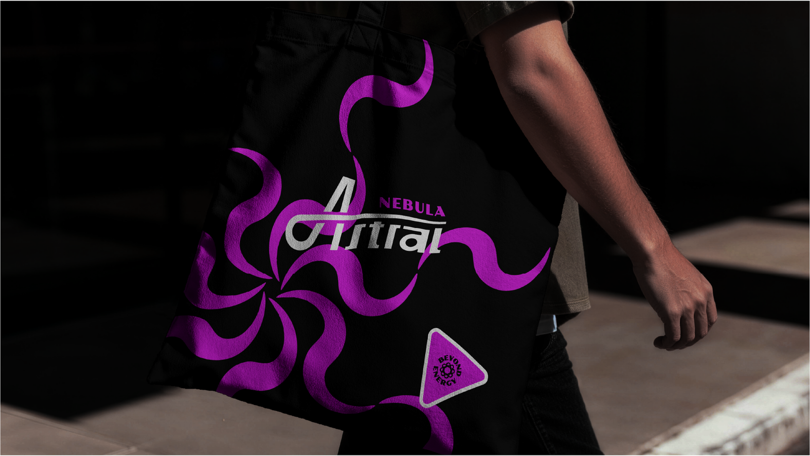
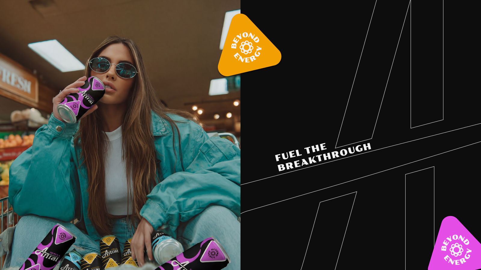
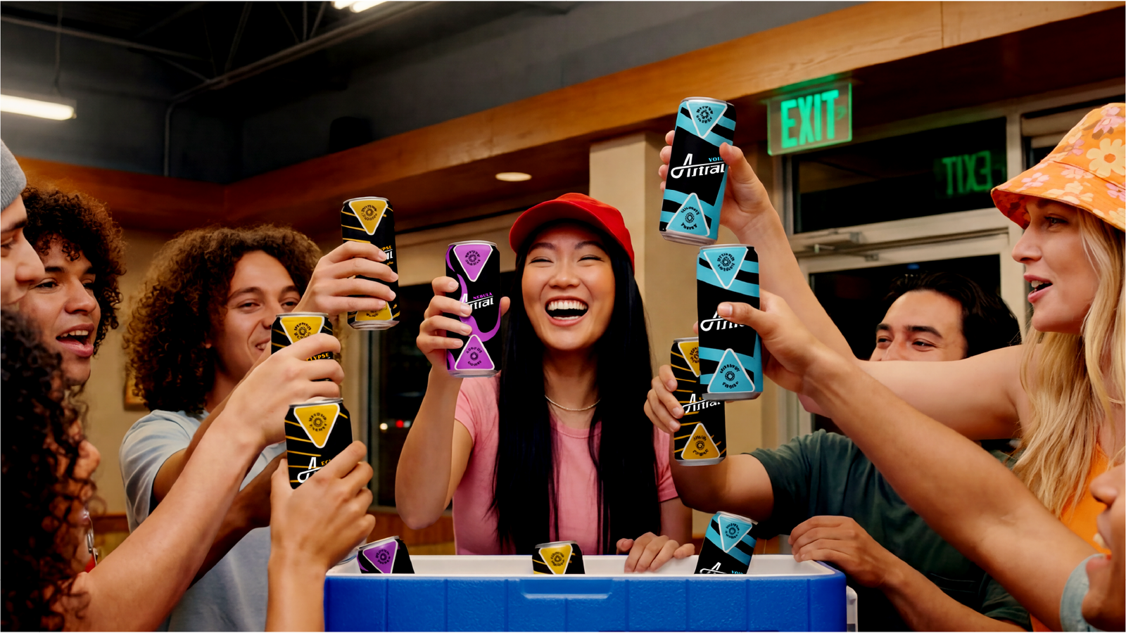
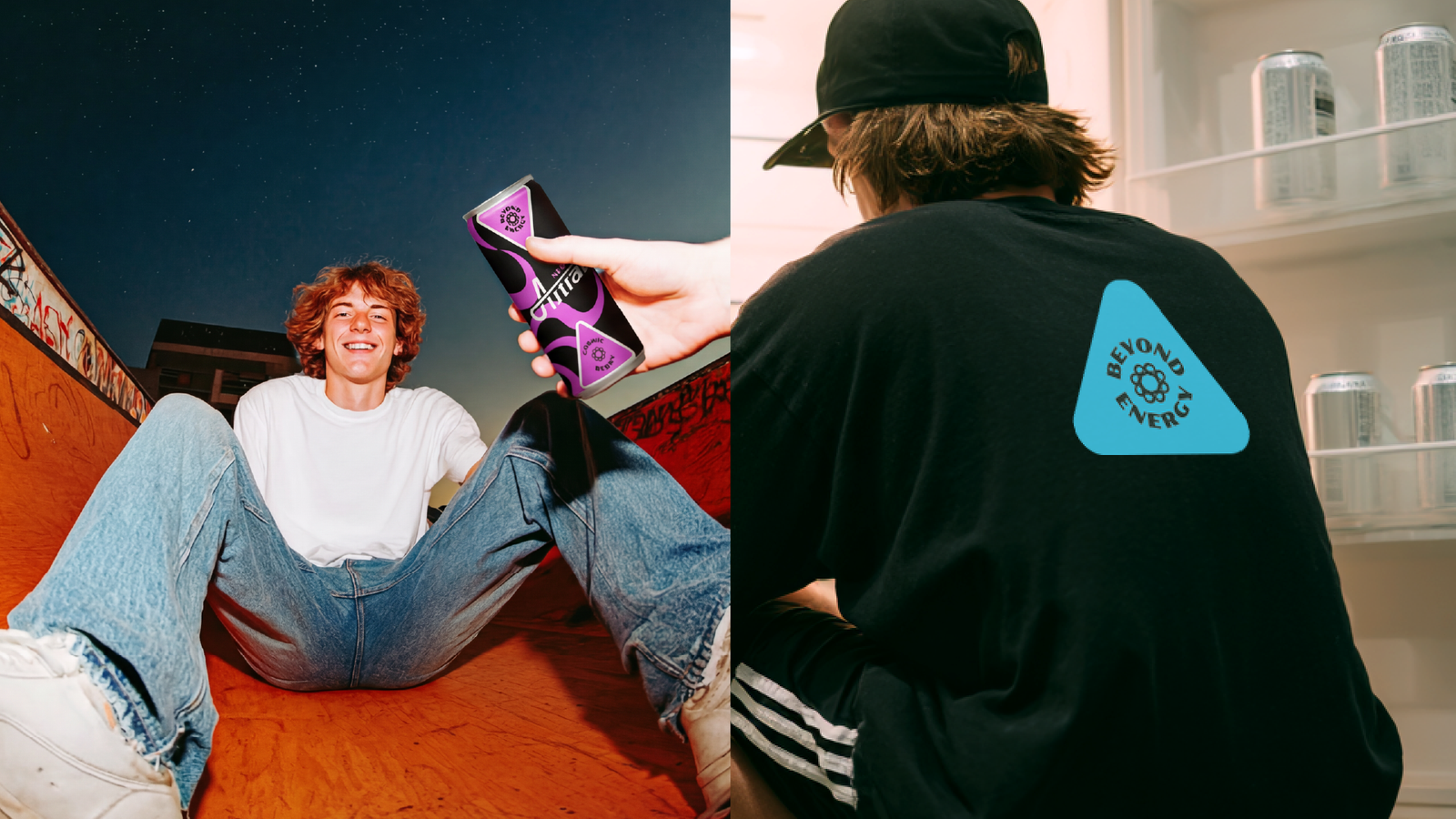
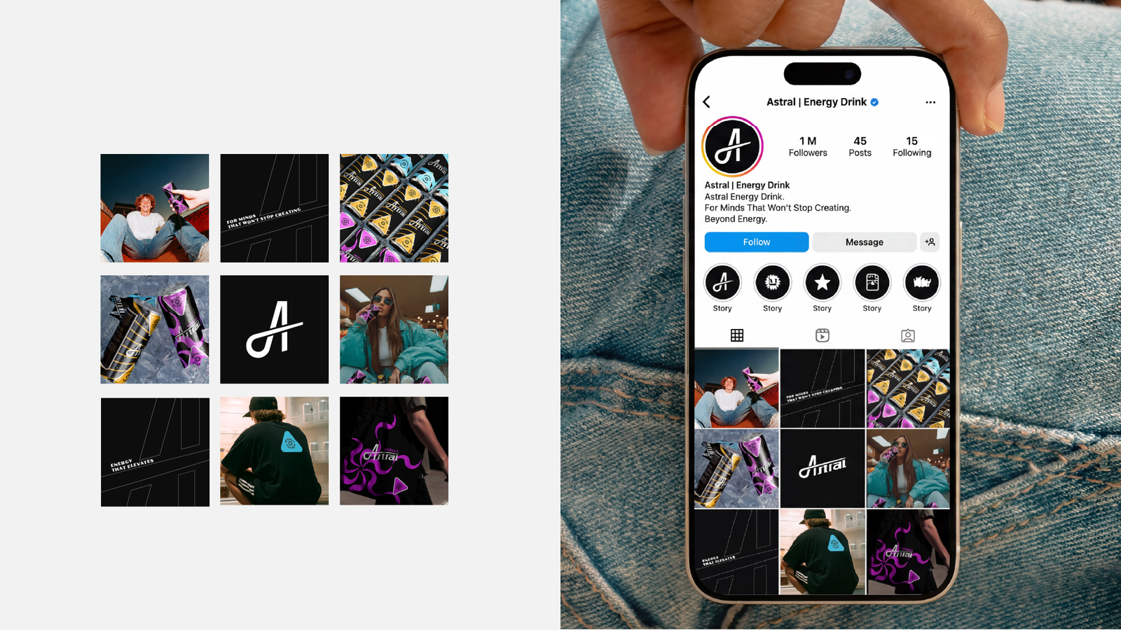
Lifestyle Applications,
Campaign Messaging,
Brand Guidelines
Deliverables
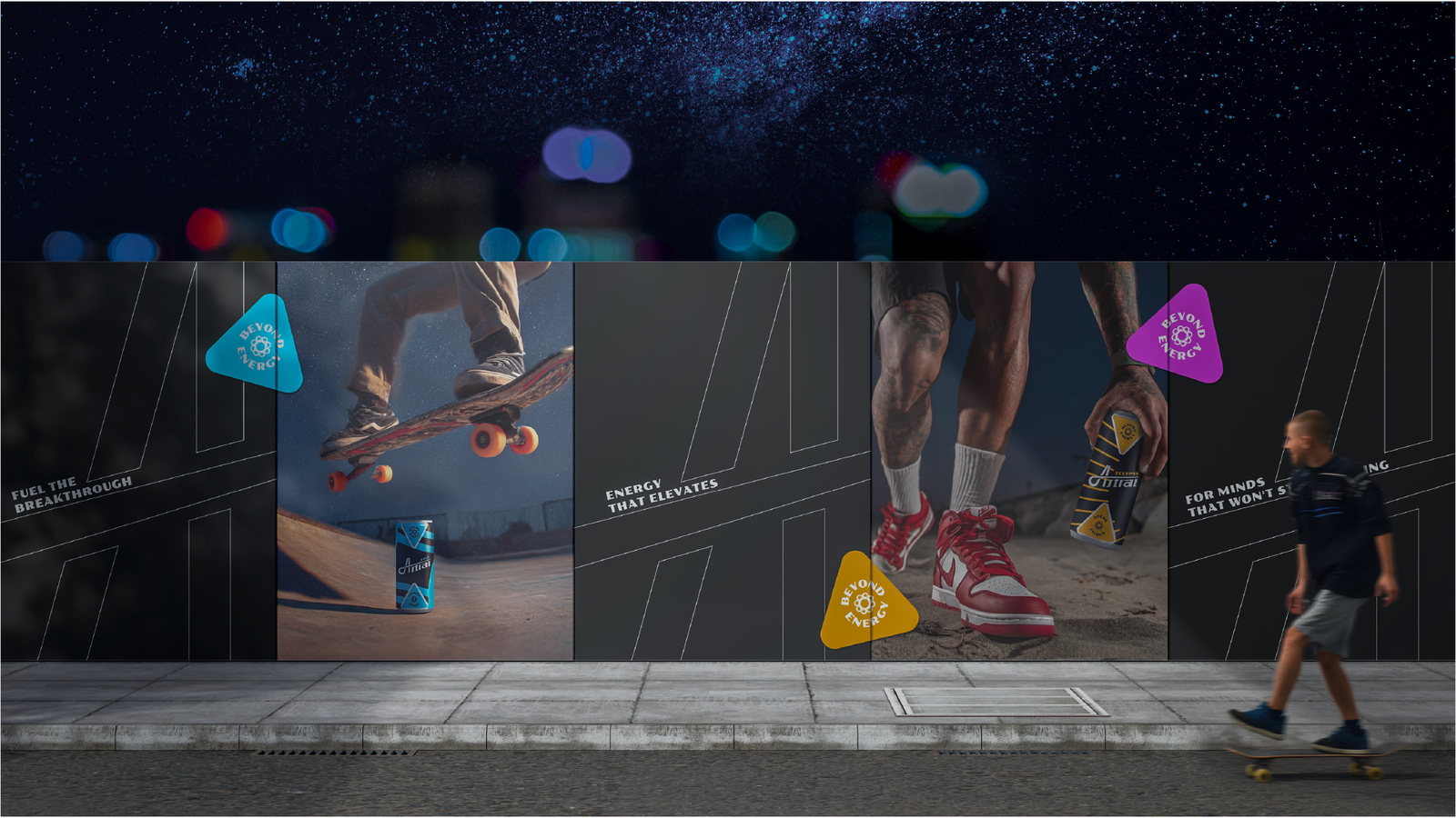
BEYOND ENERGY | How We Designed a Brand for the Night Shift Generation
Meet Astral. It's a concept for an energy drink brand, but it's not trying to be the next Monster or Red Bull. Those brands already own the loud, extreme, adrenaline-junkie crowd. We wanted to build something different.
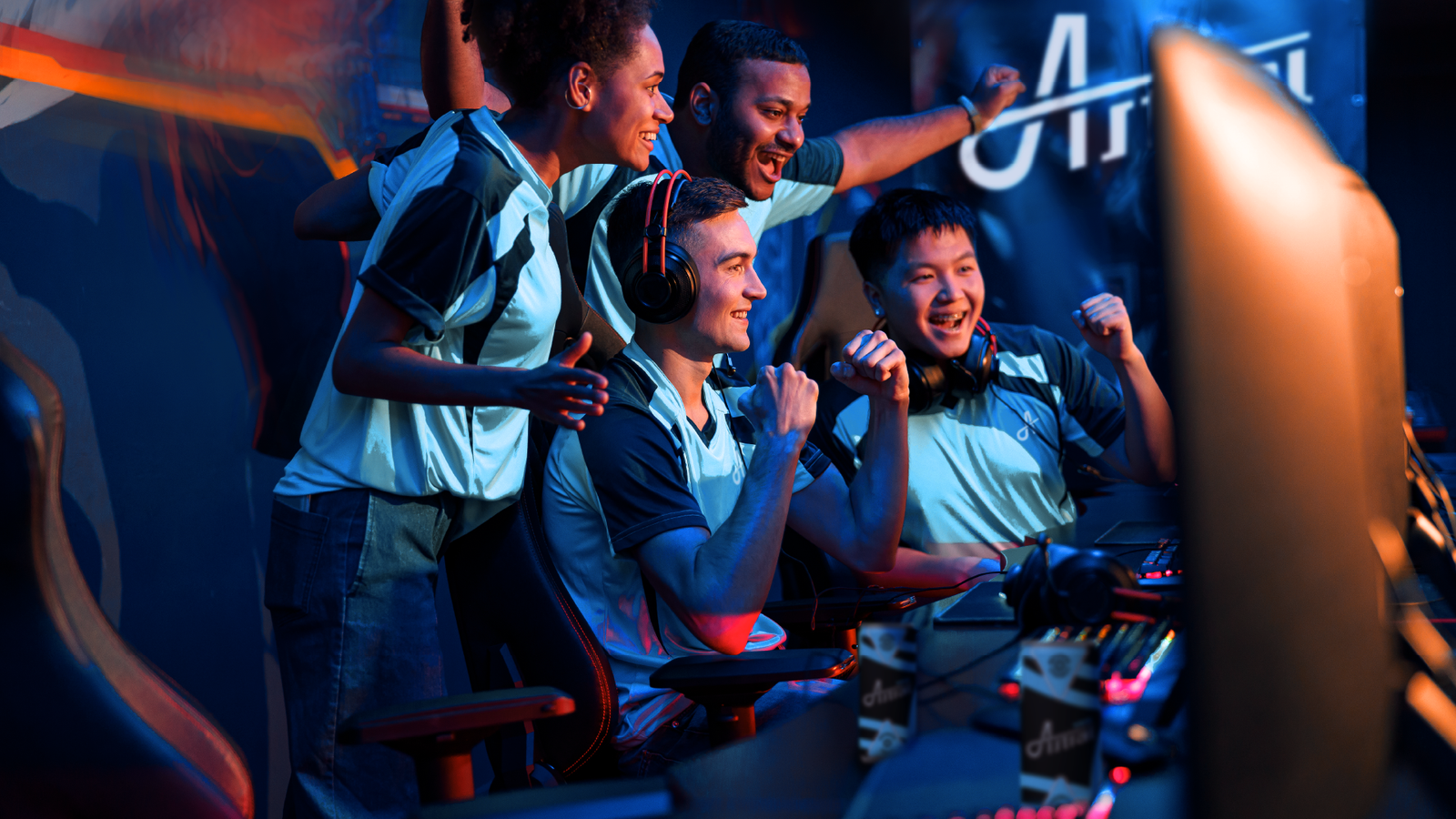
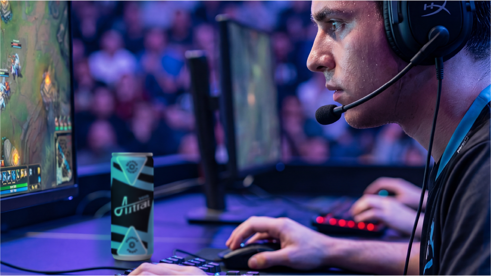
Picture the coder still at it at midnight, debugging code while everyone else is asleep. The designer who hits creative flow at 11 PM. The student pulling an all-nighter before finals. These people aren't looking for a party. They're looking for focus when the world goes quiet. We looked at the energy drink shelf and saw it packed with neon colors and extreme sports imagery, and none of it spoke to people who do their best work at night. That gap became the starting point for Astral.
Why We Built It
We wanted to challenge ourselves with a brand that could stand toe to toe with category giants. Not a logo exercise. A full system built from strategy up, the kind of project that pushes you to think like a real brand team.
The goal was clear: build the first energy drink designed for night-focused minds, not daytime hustle. Energy that breaks limits, not energy that just keeps you awake longer. And the challenge was real. Energy drink shelves are brutal. Every brand screams for attention with bright colors and aggressive messaging. We wanted Astral to stand out without copying that playbook, and we wanted it to feel premium and cosmic without turning into cheesy sci-fi. On top of that, we set ourselves the harder task: three flavors, each with its own personality, but all part of one family. This wasn't just about a nice-looking can. It was about proving we could build a brand system that works on packaging, on a billboard, and on social media.
How We Built It
We started with strategy, not design. Before any sketching happened, we needed to nail down who Astral's audience really is at their core. We landed on two archetypes: Hero and Explorer. People who go where others won't. People who venture into the unknown, whether that's the silence of 2 AM or a creative block nobody else can crack.
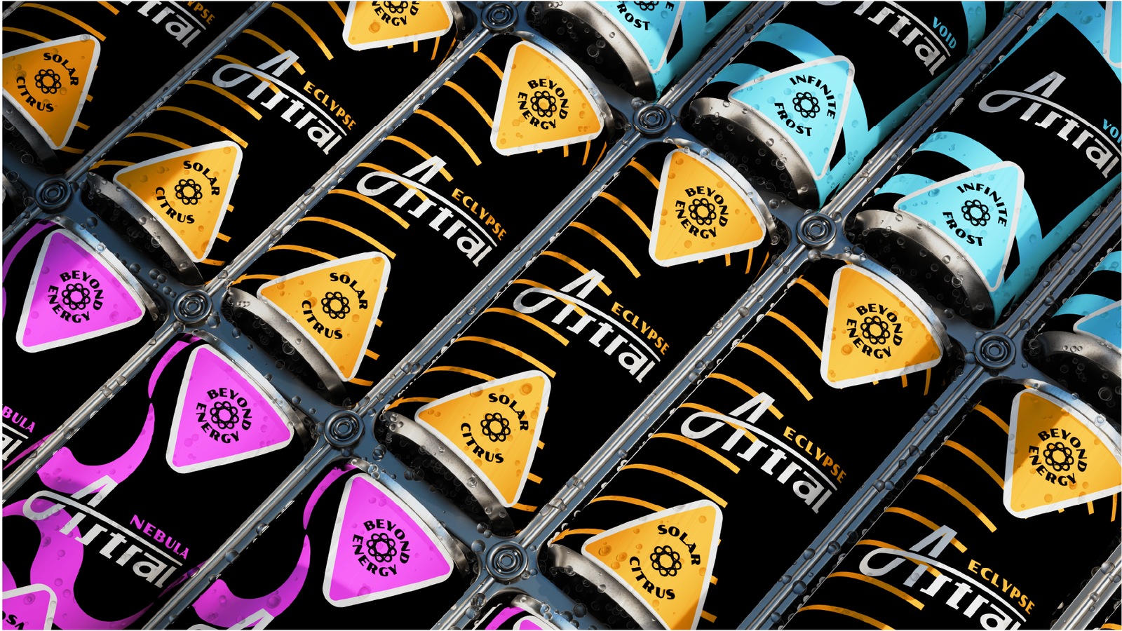
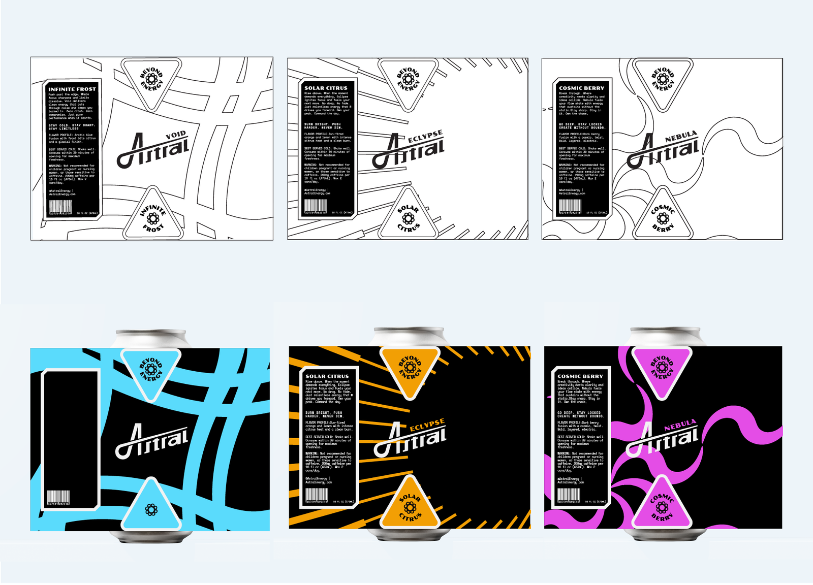
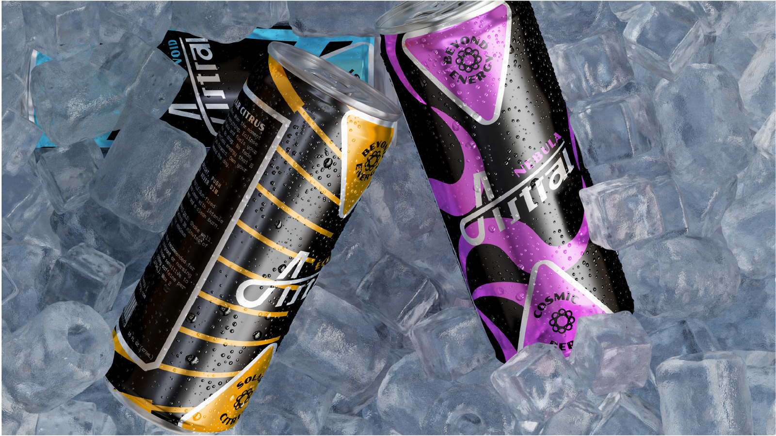
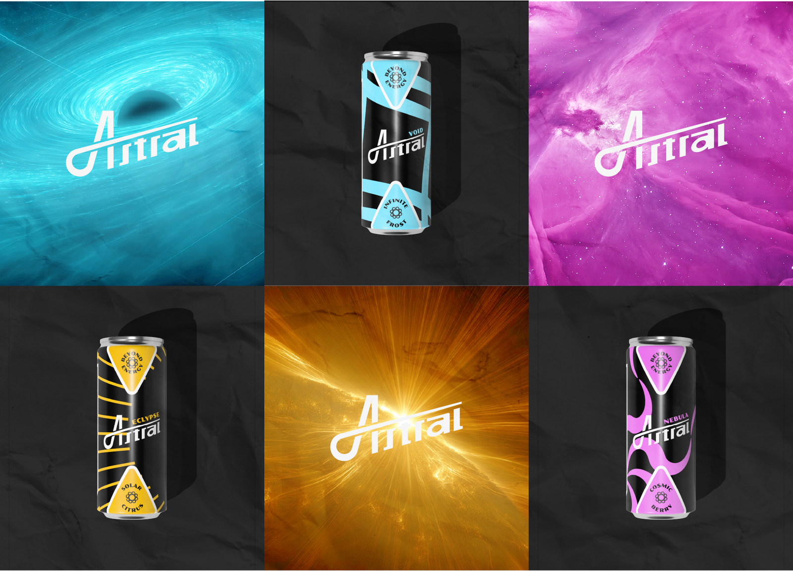
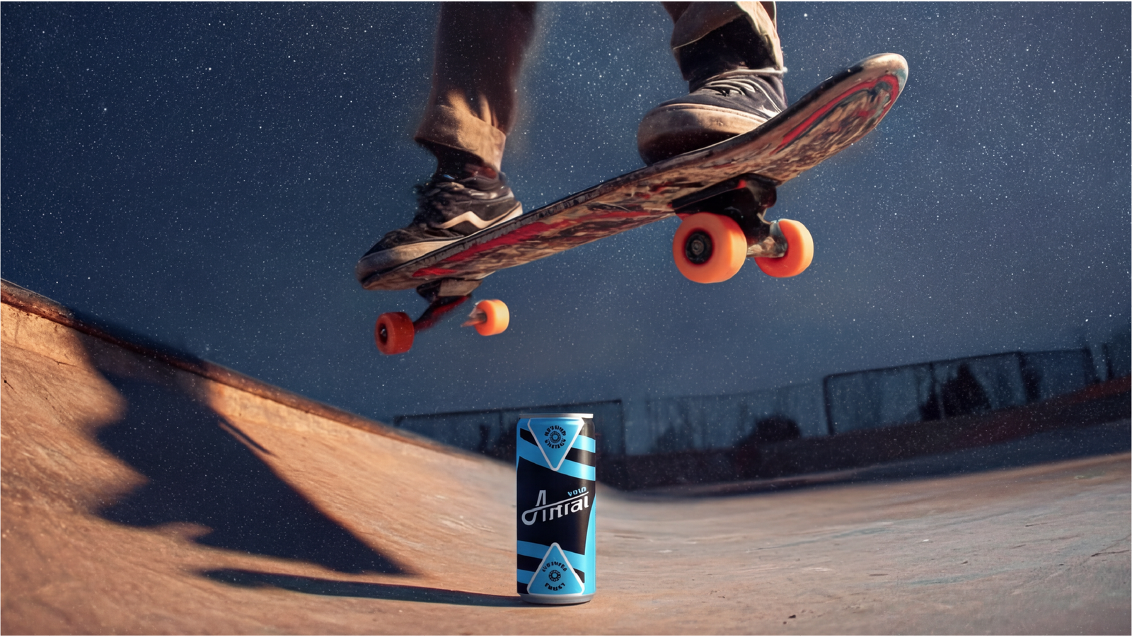
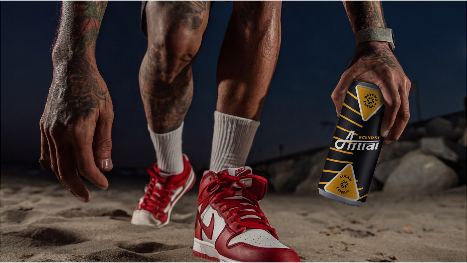
From there, we built the three-flavor system around actual space science. Void became the deep focus flavor, inspired by black holes, paired with cooling mint. Eclipse became the explosive energy flavor, inspired by solar eclipses, paired with citrus. Nebula became the creative flow flavor, inspired by cosmic particle collisions, paired with berry. Every pattern on the cans ties back to its flavor's personality. Void's stripes are angular and structured. Eclipse's rays are diagonal and dynamic. Nebula's curves flow and expand.
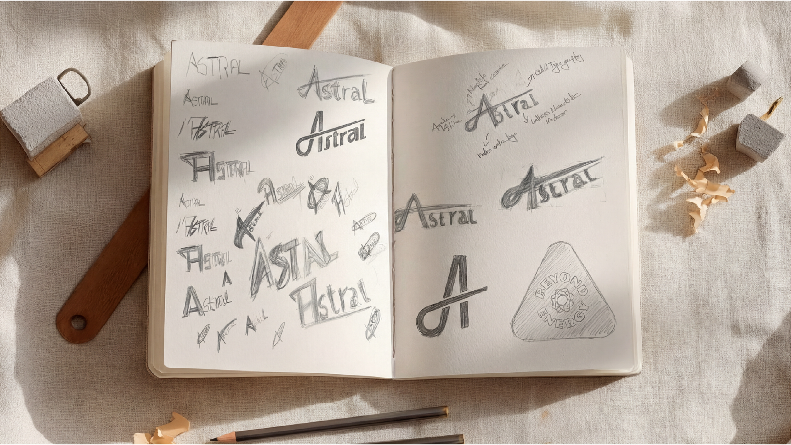
Then came the logo, and this is where things got interesting. We sketched for days, hit a wall, walked away, and came back with fresh eyes. That's when the angular "A" clicked, pulled straight from star geometry, paired with a swoosh that captures breakthrough motion. We built the wordmark from scratch so it would feel modern and cosmic without looking like a template. Then, halfway through packaging, our file crashed. Completely gone. We rebuilt it from zero, and the second version turned out better than the first. Sometimes a setback is exactly what you need.
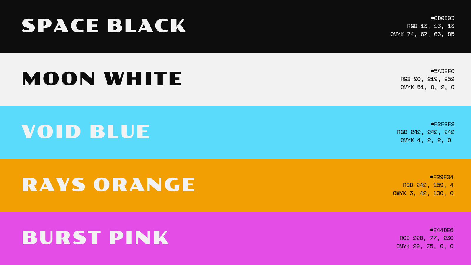
The triangle ended up becoming our anchor. It's not just a shape, it's a navigation marker that shows up everywhere: cans, apparel, ads. We picked colors with intention too. Blue for Void, because it pops on a shelf and signals tech and clarity. Orange for Eclipse, because it's impossible to miss. Purple for Nebula, because it feels creative and premium. Dark backgrounds weren't decoration either, they represented the night itself.
The Impact
Astral gave us a brand system that doesn't try to out-shout Monster and Red Bull. It speaks directly to an audience nobody else was talking to, and that audience would actually see themselves in it. The three-flavor system shows how a brand can give retailers flexibility and customers choice, while still creating one unified shelf block. Line up all three cans and you instantly see a family. Put just one next to a competitor and it still stands out as something different.
This system is also built to grow. The triangle badge works for any future flavor or product line. The cosmic aesthetic can expand without losing what makes Astral, Astral. And the Hero and Explorer positioning gives the brand a clear lens for every future decision, from sponsorships to content to retail strategy.
Most importantly, this project became a portfolio piece strong enough to open conversations with major beverage companies like PepsiCo, Monster, and Red Bull. It shows that every design choice traces back to a real business goal and a real audience need, not just a nice visual. Astral proves we can think like a brand team, not just a design studio, and that's exactly the kind of work that opens doors to bigger clients and bigger projects.
Astral is positioned to attract dream clients, earn Behance recognition, and open doors to contracts with major FMCG brands. The brand is ready to fuel breakthroughs — not just for night workers, but for Astral's own growth trajectory.